TE Consulting
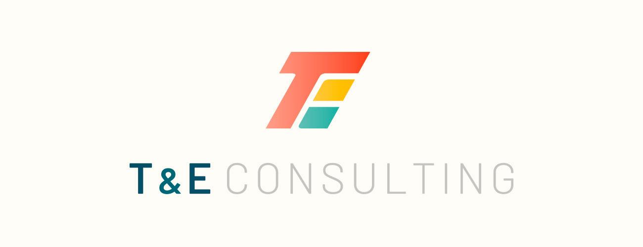
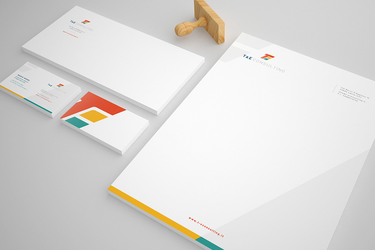
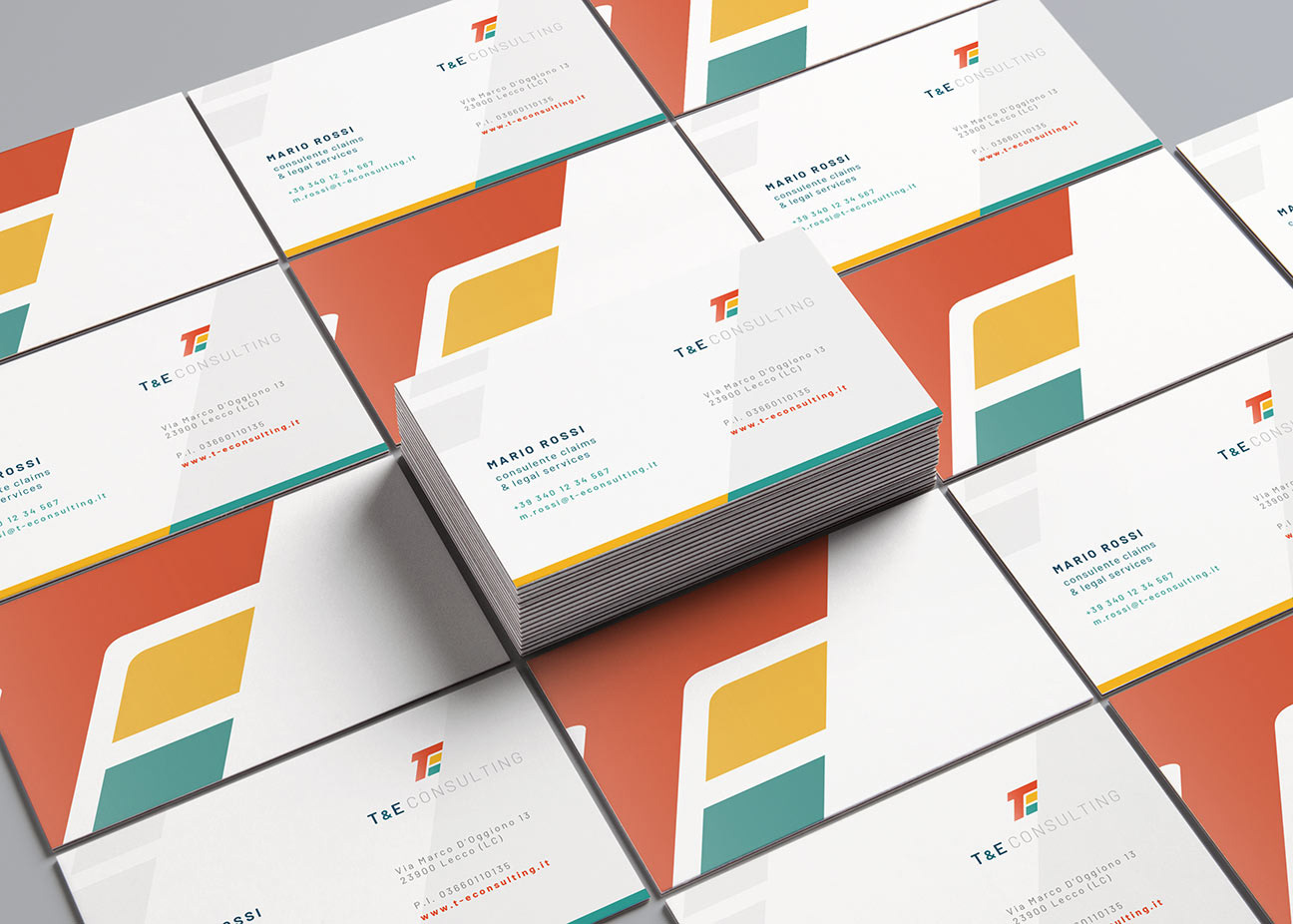
I had the opportunity to create the logo and coordinated image for the consulting firm TE Consulting. This project was driven by the desire to capture the company’s youthful and dynamic spirit, setting it apart from the traditional, often dull communication style typically associated with the consulting sector.
The logo served as the starting point. I used vibrant colors to inject energy and vitality into the visual identity, giving TE Consulting a distinctive edge. This color choice helped break conventional patterns, projecting a fresh and innovative image.
The logo’s shape features a slight tilt, adding a sense of dynamism. This inclination conveys movement and progress, reflecting TE Consulting’s proactive and forward-thinking approach to consulting services.
For the font, I selected a modern and “tech-inspired” style, which conveys professionalism and expertise. This combination of typography contributes to balancing seriousness with dynamism, which is emblematic of a young and ambitious company like TE Consulting.
The coordinated image was built around these principles, ensuring consistency and cohesion across all branding materials. From corporate presentations to online communications, every element reflects the company’s distinct identity.
The work for TE Consulting created a brand and coordinated image that break away from the traditional norms of the consulting industry. The vibrant colors, the dynamic tilt of the logo, and the modern typography combine to convey a unique blend of professionalism and energy. This design reflects the youthful and ambitious personality of the company, setting it apart in the competitive consulting arena and communicating a message of innovation and dynamism.
Date
June 15, 2021


