ECA Brochure
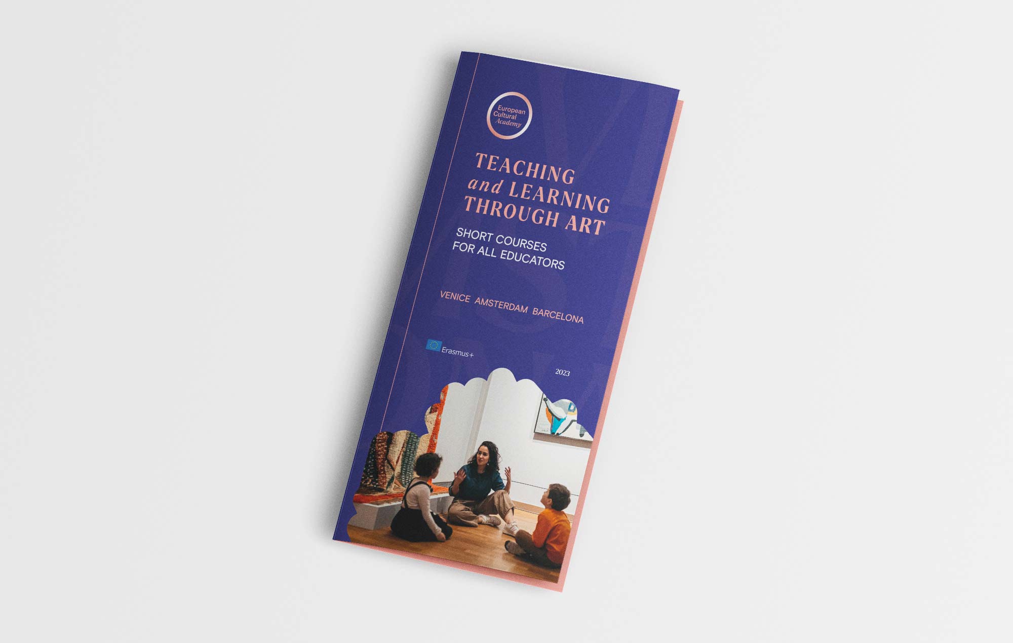
The creation of a three-panel brochure for the European Cultural Academy (ECA) represents a synergy between graphic design and effective communication. This work was conceived with the aim of illustrating short courses for teachers in the field of Art, held in three fascinating European cities: Amsterdam, Barcelona, and Venice. By merging the ECA guidelines with engaging design, the brochure captures the essence of a unique educational experience.
The approach to the brochure’s realization is firmly rooted in the directives of the European Cultural Academy, reflecting the shapes, colors, and fonts that represent the institution’s visual identity. Every element has been carefully studied, creating a visual harmony that conveys the seriousness and professionalism of the ECA. This visual coherence not only captures attention but also ensures immediate recognition of the institution.
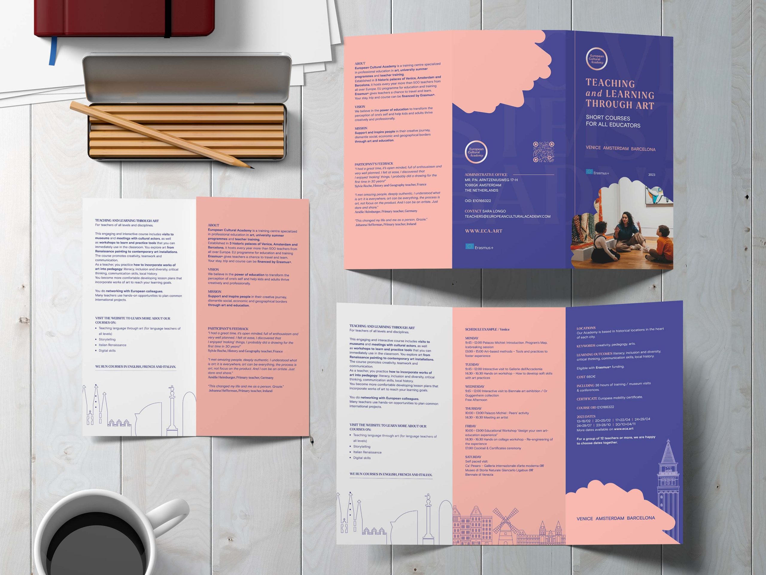
The brochure is structured into three panels, each dedicated to one of the charming cities hosting the courses: Amsterdam, Barcelona, and Venice. This allows for a detailed overview of educational opportunities in different European locations, capturing the interest of an international audience.
The layout of the brochure is designed to guide the reader’s eye through the key information. The design approach, in addition to adhering to the ECA guidelines, was also shaped by the need to effectively communicate complex information clearly and engagingly. The balance between text and images, the strategic use of colors, and the arrangement of elements guide the reader through a seamless journey of discovery.
Date
June 21, 2021


