Hotel Florence
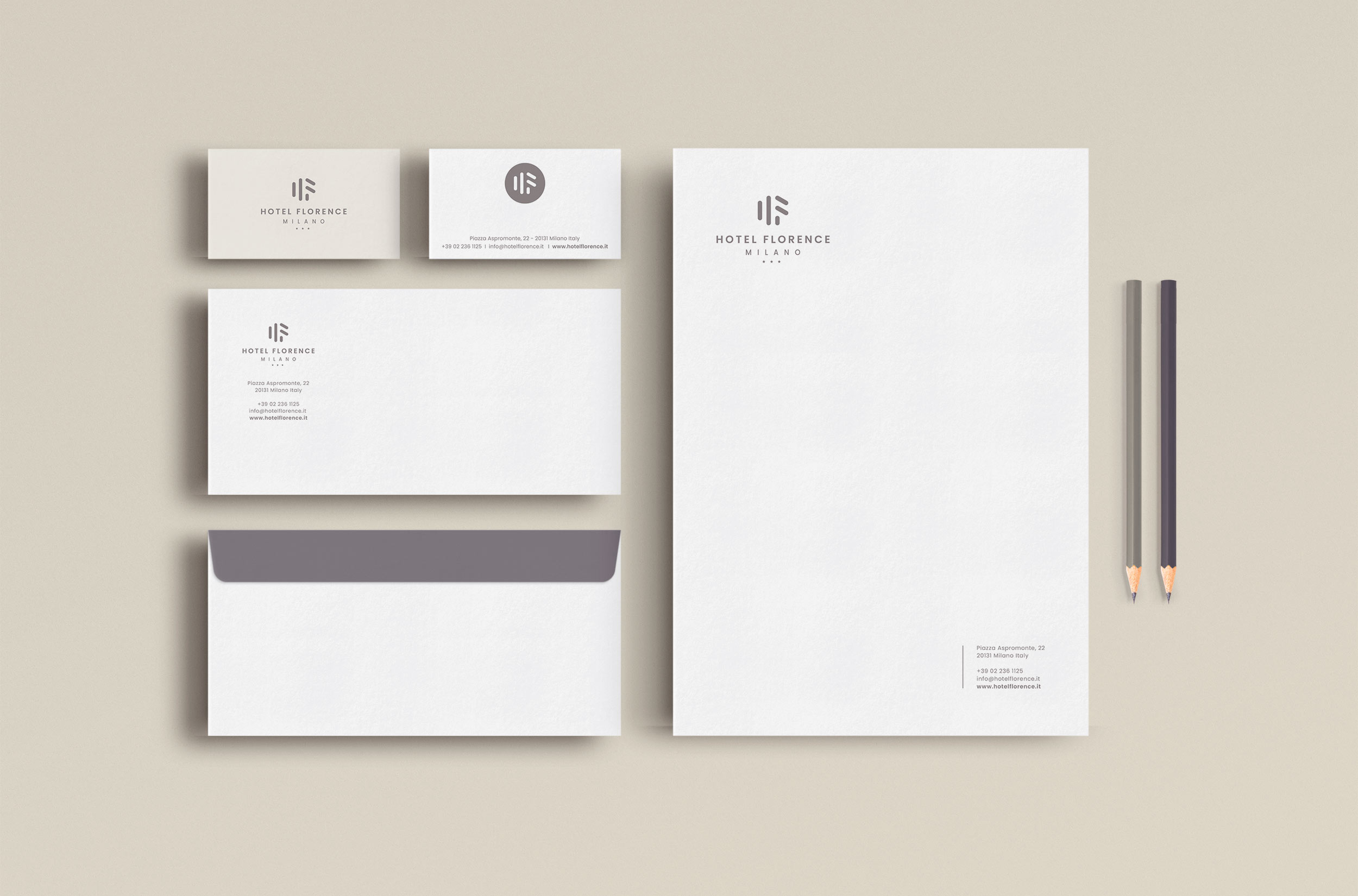
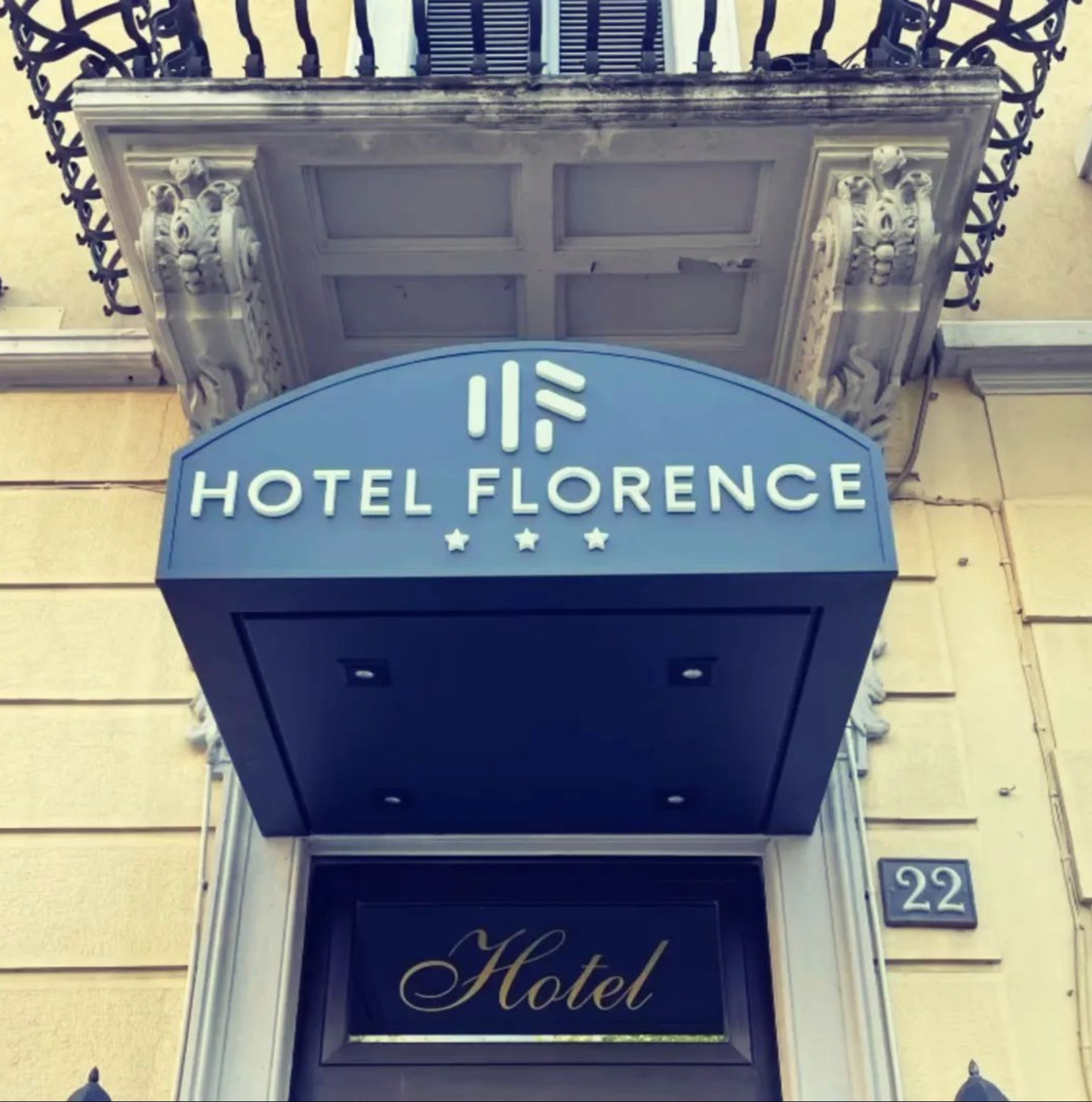
The creation of the logo and coordinated image for Hotel Florence in Piazza Aspromonte, Milan, marked a radical shift, bringing the hotel’s brand into a new era of modernity and hospitality. The goal was clear from the outset: to refresh the hotel’s image and project it into a fresher dimension, aligning it with the welcoming experience the hotel offers.
The geometric construction of the new logo provided a solid foundation to work on, while modernizing the shapes evoked comfort and hospitality. The decision to soften the corners and make the forms less angular was made to create an image that conveyed warmth and well-being, reflecting the essence of the hotel’s hospitable experience.
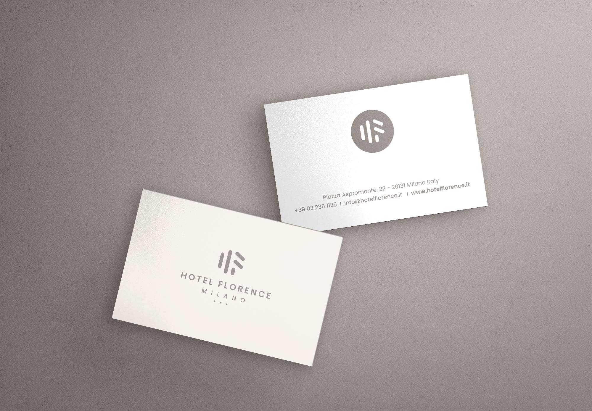
The choice of soft color tones was made to align with the hotel’s interior design, aiming to create a welcoming and relaxing atmosphere. These colors emphasize the tranquil and comfortable ambiance that the hotel strives to offer its guests.
A key aspect of this transformation was the use of a modern sans-serif font for the logo and coordinated image. This choice created a sharp contrast with the hotel’s past image, highlighting the break from the old style and conveying a message of renewal and modernity. The font contributed to creating a direct visual connection with the desired clientele, projecting an image of prestige and professionalism.
The creation of the logo and coordinated image for Hotel Florence in Milan marked a significant transformation. The refresh operation has brought the hotel’s brand into a new dimension of modernity and hospitality, capturing the essence of the experience guests can expect during their stay. The use of geometric construction, softened shapes, soft colors, and a modern font has created a visually attractive and cohesive brand, reflecting the hotel’s mission to offer a high-quality, welcoming experience.
Date
August 16, 2023


