Locanda ai Santi Apostoli
My work for Locanda ai Santi Apostoli in Venice is an example of balancing the client’s requests with my creativity in the field of graphic design. From the outset, the client’s request was clear: to represent the distinctive element of the inn, the large fireplace at the entrance, through a logo and coordinated image that would reflect the unique and welcoming atmosphere of the space.
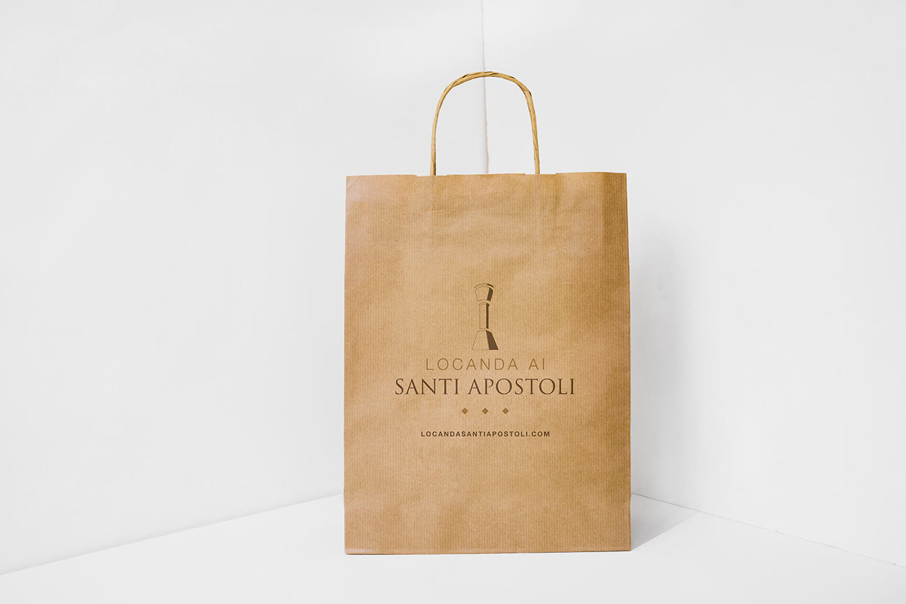
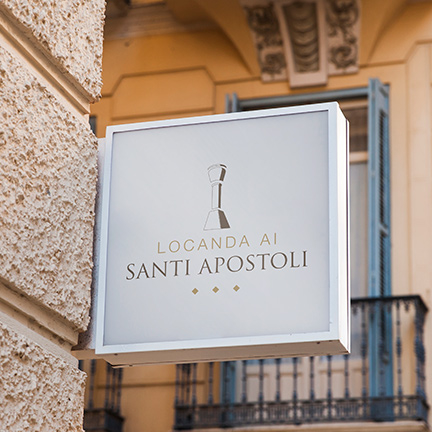
I approached this project with dedication, aiming to capture the essence of the fireplace and stylize it in a distinctive way. The stylized representation of the fireplace in the logo became a visual icon, a tangible symbol of Locanda ai Santi Apostoli. This element not only references the inn’s key architectural feature but also represents the warm and inviting ambiance that guests can expect inside.
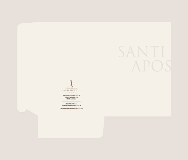
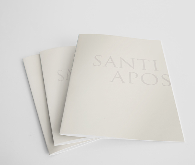
One of the highlights of this creation is the balance between the serif and sans-serif fonts used in the logo and coordinated image. This contrast creates a sense of elegance and sophistication, mirroring the class and comfort of the inn. The use of these two fonts enhances the brand’s distinctive character, making it immediately recognizable.
The attention to detail extended beyond the typography to the choice of colors. The use of warm beige tones communicates a sense of welcoming warmth and genuine hospitality. This color palette perfectly aligns with the inn’s identity, offering a reassuring and pleasant visual experience.
The creation of the logo and coordinated image for Locanda ai Santi Apostoli is not just an example of visual design but represents an emotional journey, uniting the unique identity of the place with an effective graphic synthesis. The result is a visually striking brand that stands out for its elegance and authenticity. Every time guests enter the inn, the logo embodies the warm welcome and authentic experience that awaits them, establishing a tangible visual connection between the brand and the heart of the business.
Date
August 16, 2023
