Maniago Brewery
The work for the Maniago Brewery was a fun experience in the world of creating brands and labels that reflect the identity and personality of craft beers. The starting point was the logo, a crucial element for representing the soul of the brewery and its creativity.
Alice, the owner of Maniago Brewery, is a lively and creative spirit, and she wanted her brand to embody this uniqueness and charm. Her “grunge” and cheerful style needed to be conveyed in the corporate image and the beer labels.
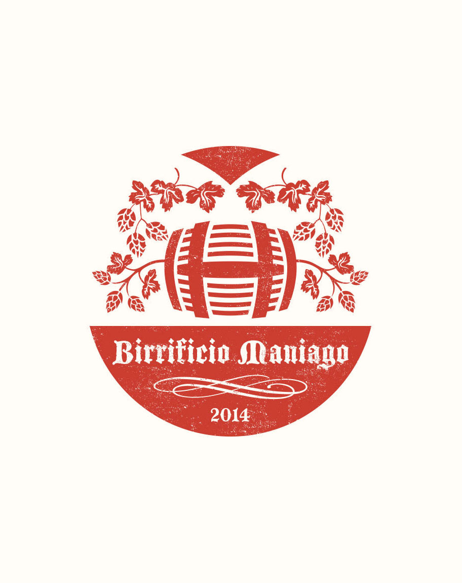
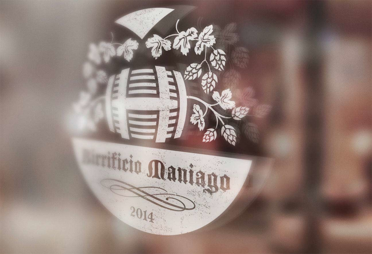
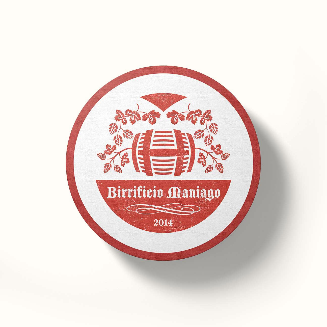
The first challenge was to create a logo that encapsulated the grunge and vibrant atmosphere Alice envisioned. The result was an illustration featuring a barrel surrounded by hops, highlighted by a subtle “weathered” effect that evokes the grunge style. This logo has become the recognizable emblem of Maniago Brewery, representing the brand’s unique personality.
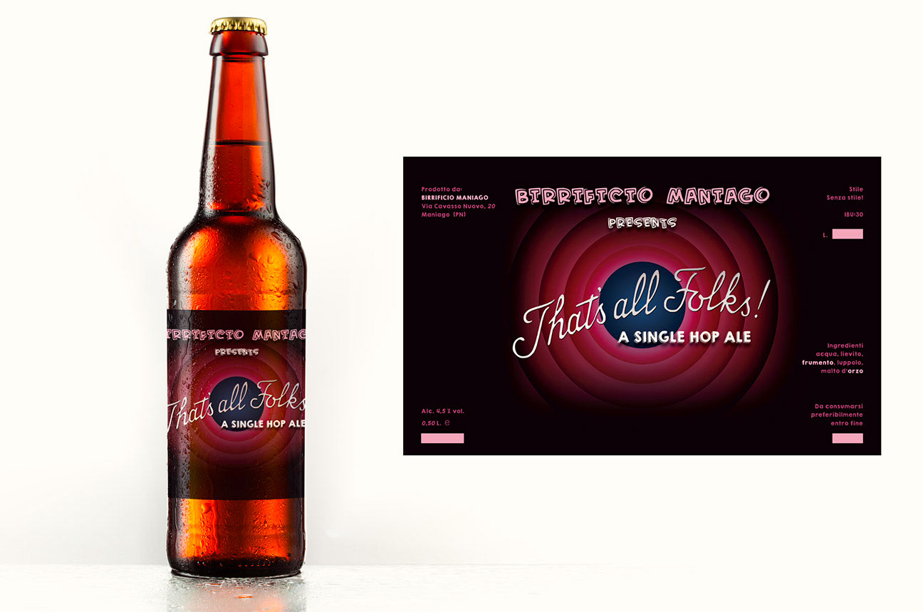
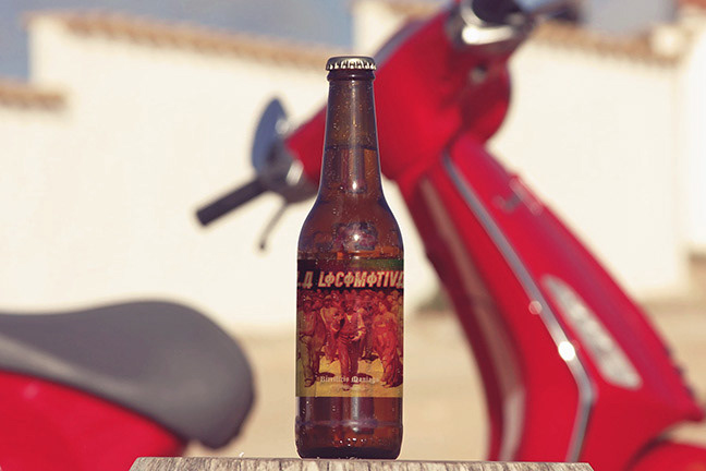
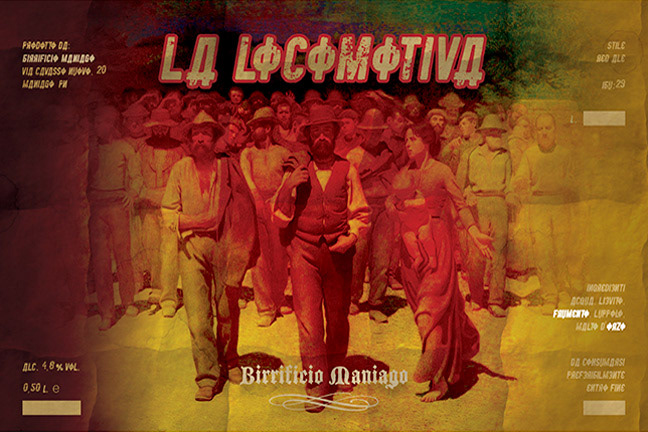
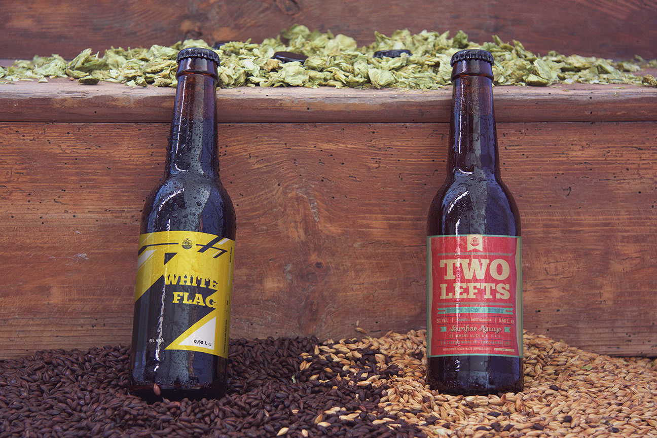
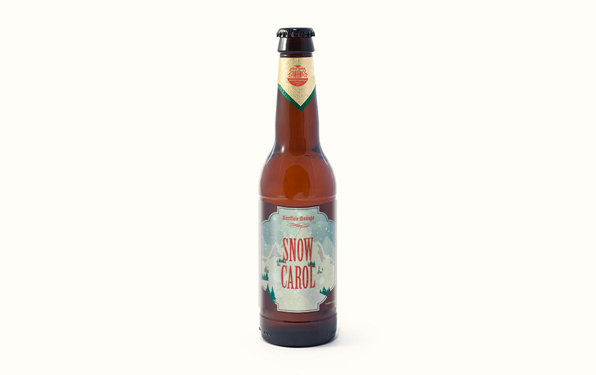
The beer labels were equally important in creating a distinct visual identity for each beer. Each label was designed to reflect the unique character of the corresponding beer and to meet Alice’s requests. From the “red” beer La Locomotiva, inspired by Soviet style, to the “That’s all Folks!” beer, reminiscent of cartoon aesthetics, and the Snow Carol, a Christmas beer with a festive atmosphere, each label tells a different and engaging story.
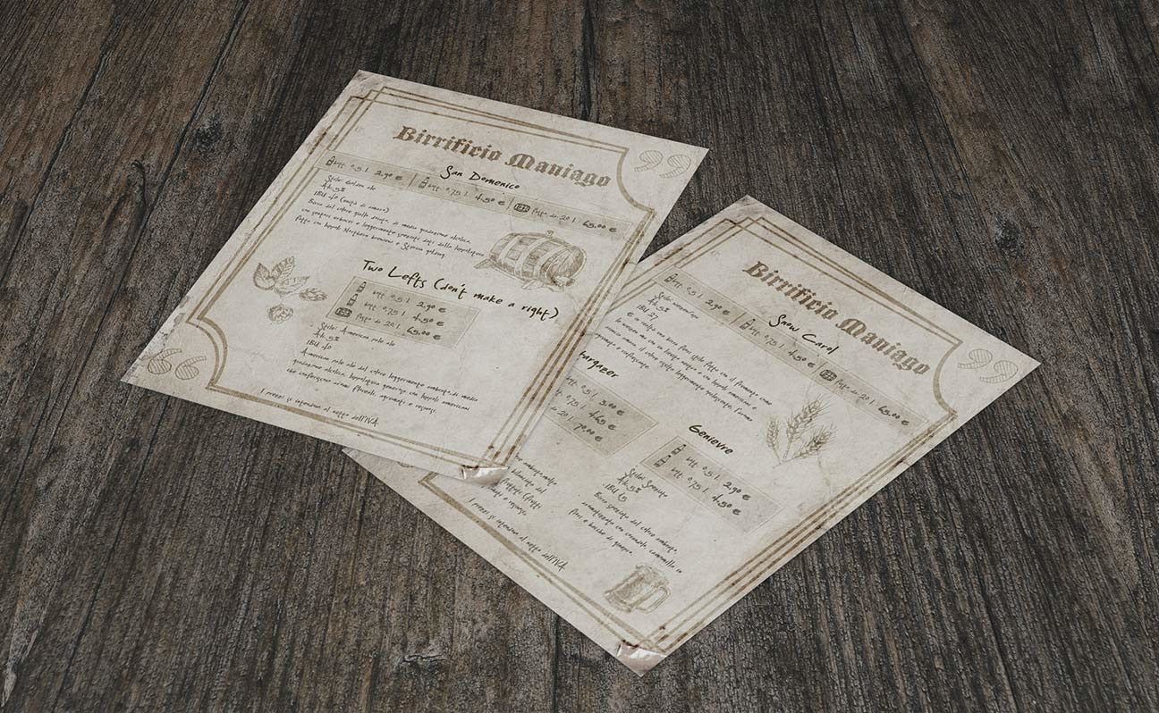
In addition to the labels, I created detailed technical sheets for the beers, which are distributed to retailers. These sheets provide essential information about the composition and characteristics of the beers, helping to promote them in a professional and accurate manner.
Maniago Brewery boasts a vibrant, grunge, and unique visual identity that faithfully reflects Alice’s personality and the variety of her craft beers. From the logo to the labels to the technical sheets, every element has contributed to building an engaging brand image for Maniago Brewery.
Date
June 25, 2021
