Massage Temple
The work for Massage Temple, led by Ginnaree Chuyatt, a professional Thai massage therapist based in the Netherlands, was a fascinating fusion of the symbolism of psycho-physical well-being and the cultural roots of Thailand. The goal was to create a brand that captured the essence of wellness while evoking Ginnaree’s homeland.
The resulting brand is a modern tribute to Thailand, embodying the harmony between tradition and modernity.
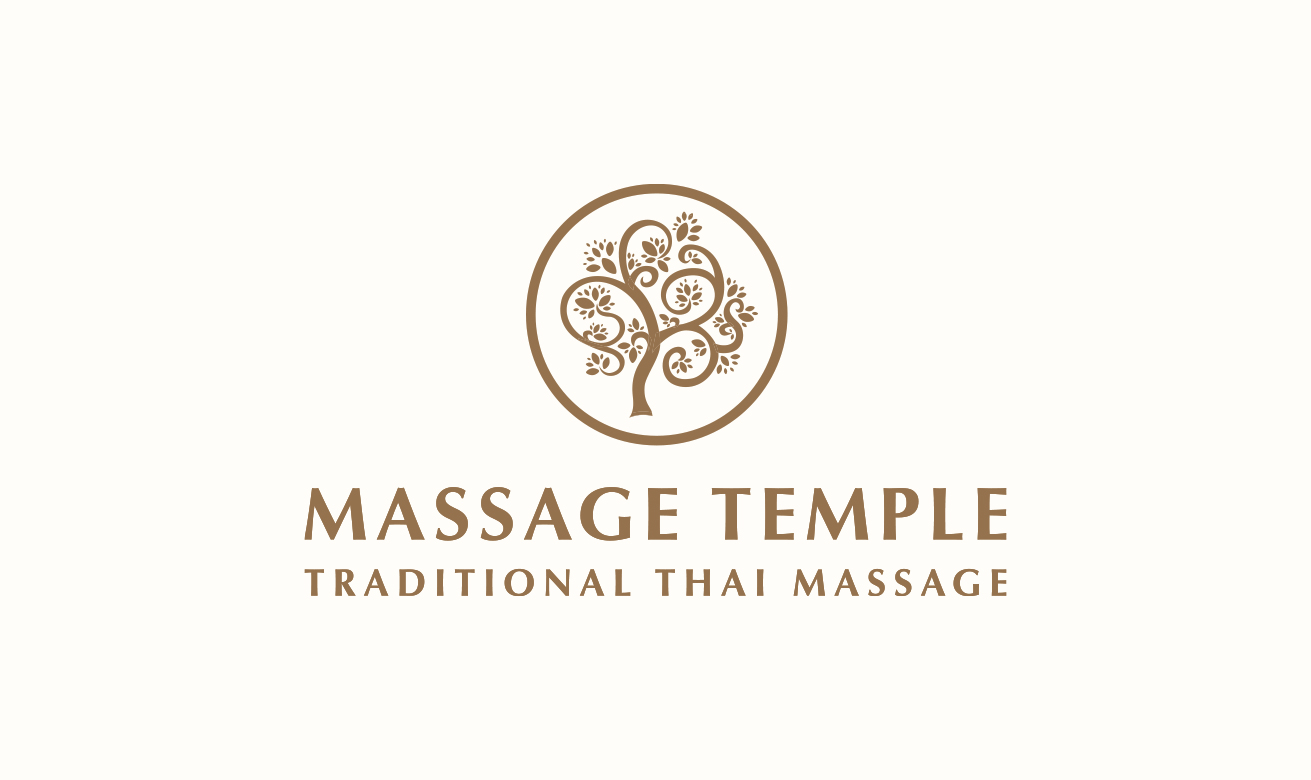
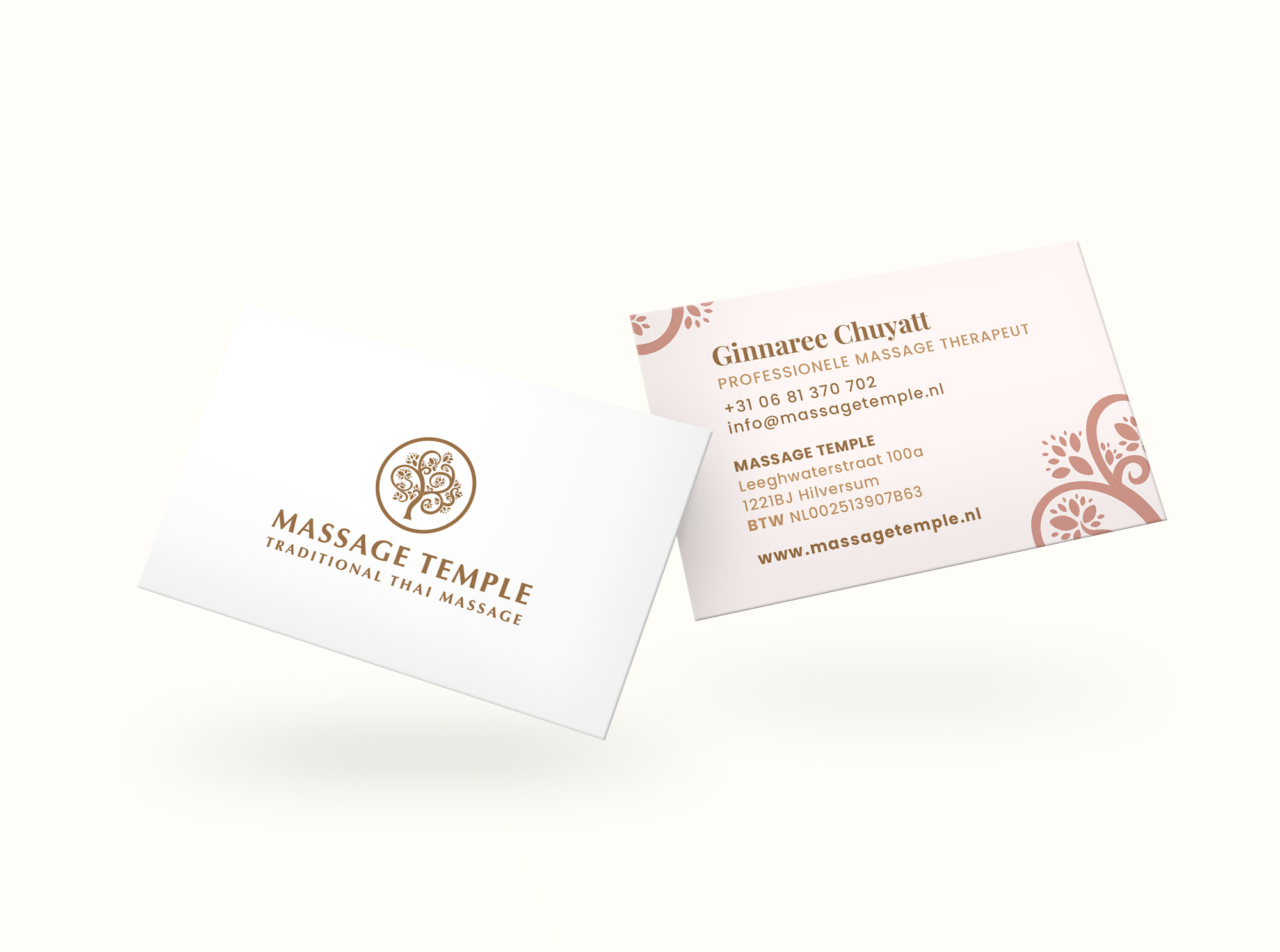
The central element is a stylized tree, symbolizing life and balance, which perfectly represents the concept of psycho-physical well-being. The tree was made even more meaningful by using gold, a color that conveys the precious and refined nature of the experience offered by Massage Temple.
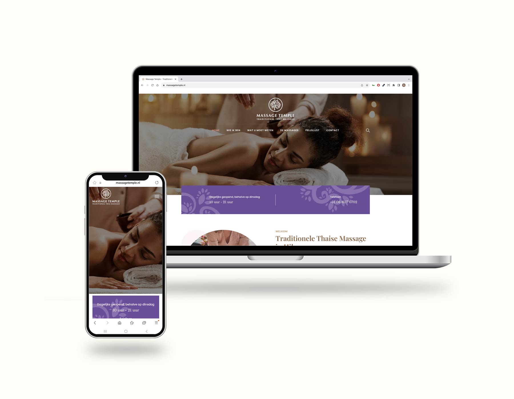
The brand’s symbolism extends to the colors and shapes used. The WordPress site (massagetemple.nl) I created follows the same design philosophy. Gold, a color associated with wealth and spirituality, is combined with shades of magenta and purple, colors often used in spa and massage environments. This color combination not only creates a welcoming and luxurious visual atmosphere but also evokes the traditional concept of therapeutic wellness.
My work for Massage Temple was a journey toward building a visual identity that reflects Ginnaree’s expertise and passion in the world of Thai massage. The brand conveys a sense of refinement and authenticity, channeling harmony and wellness into every visual element.
In essence, it is a tangible testament to how design can capture the essence of a business while honoring its cultural roots. The brand is a perfect blend of modernity and tradition, offering clients a visual experience that reflects the care and attention Ginnaree puts into her treatments.
Date
August 16, 2023


