SLED
The project I developed for the law firm Enne-Dell’Isola, known as SLED, was an exciting journey toward creating a visual identity that captured the unique and innovative essence of the firm. SLED is much more than a “traditional” law firm, and my challenge was to translate this distinctive spirit into visual elements.
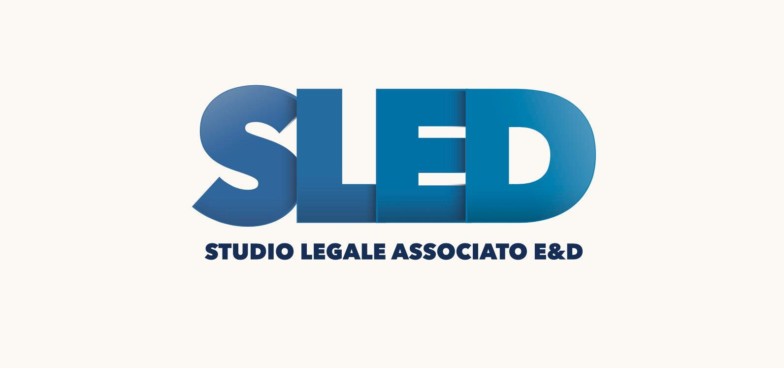
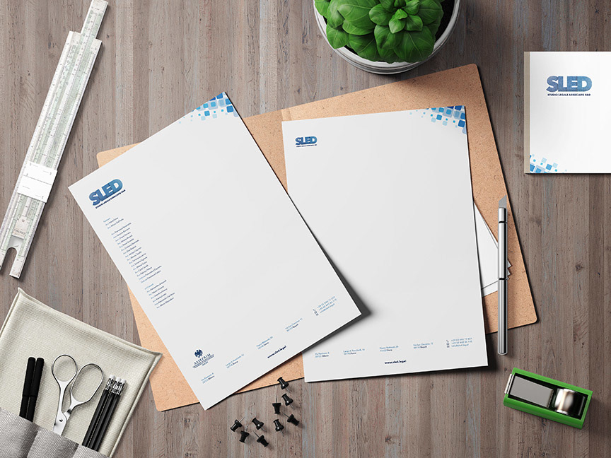
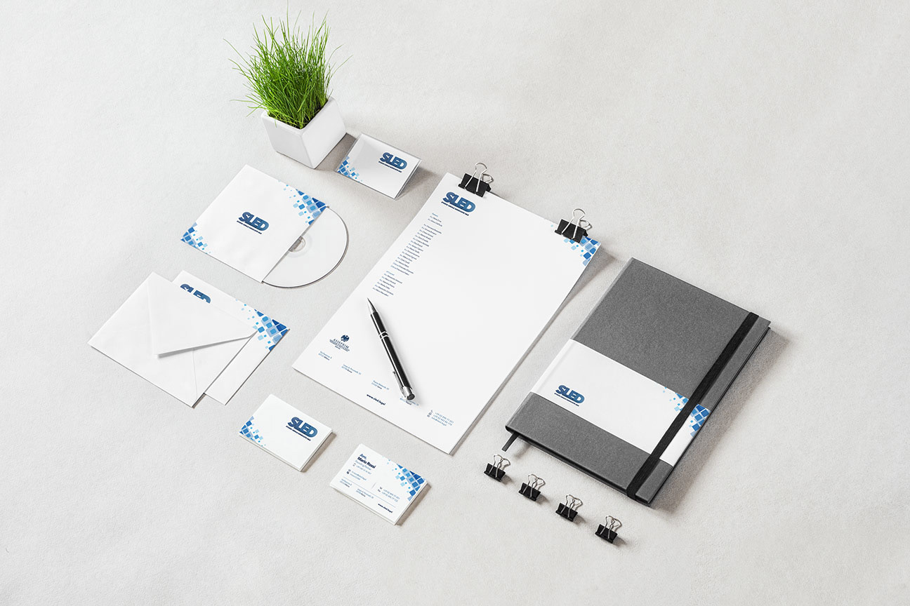
The primary goal was to create a modern and dynamic representation, moving away from the rigidity and heaviness often associated with legal firms. The solution was a gradient blue logo with varying shades, characterized by overlapping letters. This composition gives a sense of compactness and dynamism, attracting attention through its diversity.
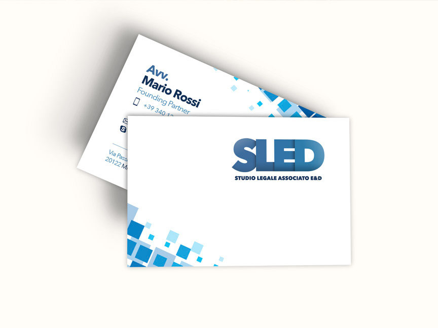
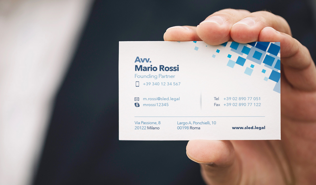
Once the logo was established, I proceeded to design the coordinated corporate image. The choice of the square as the foundational shape symbolizes balance and seriousness, but I made the concept more playful and dynamic through an “exploded” form. This adjustment added a sense of movement and speed to the overall image, conveying a feeling of rapid action and modernity.
The winning aspect of this project lies in the bold contrast between the rigid square shape—reflecting the essential qualities of a law firm—and the dynamic nature of the logo and its applications. This combination creates a balance that merges the solidity and professionalism expected in the legal field with the modernity and quick assistance that SLED offers its clients.
The resulting image is a successful visual representation of SLED’s identity, standing out for its innovation and fresh approach. This project demonstrates how thoughtful design can transform an idea into a visual identity that captures a company’s essence and personality.
Date
August 15, 2023
