Travelux Italy
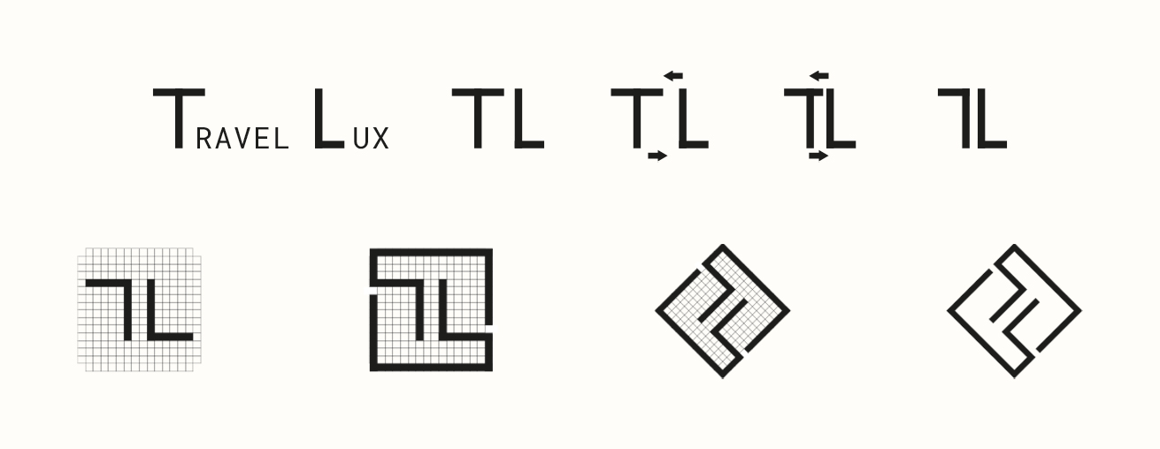
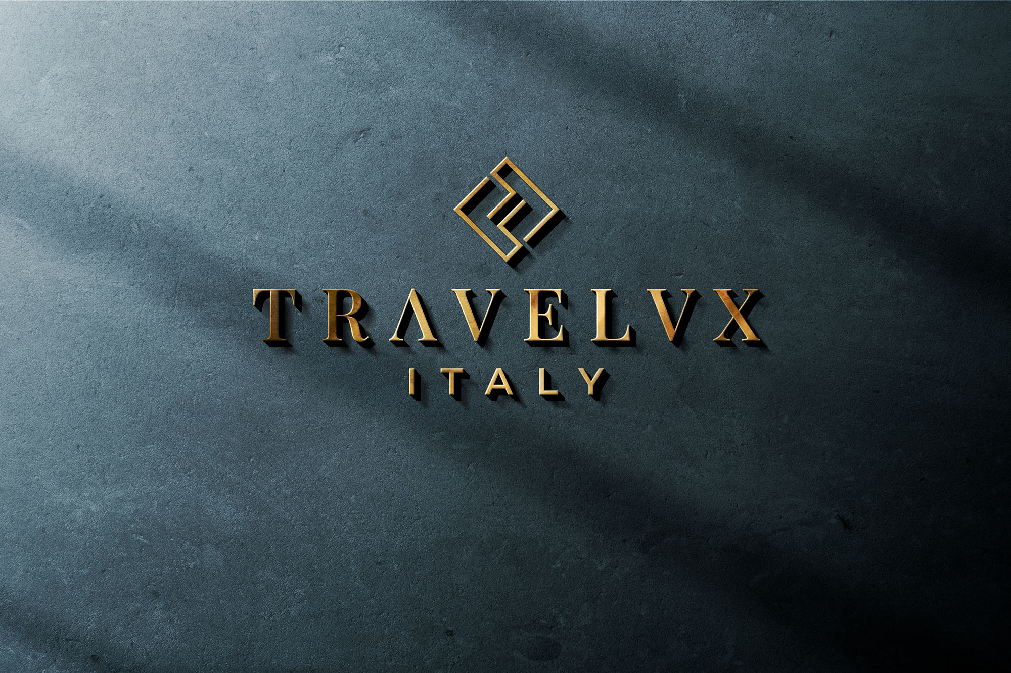
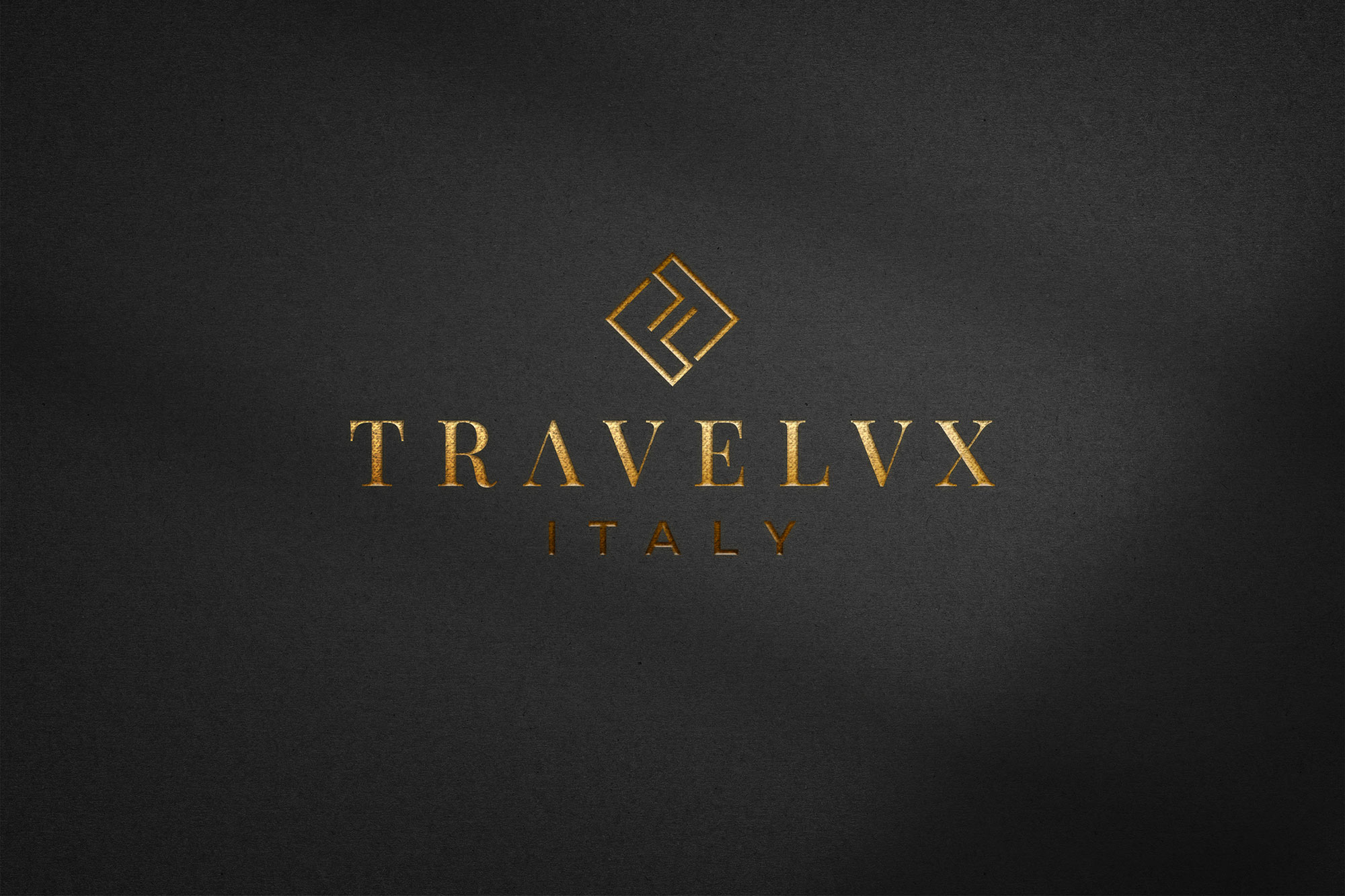
I developed the brand for Travelux Italy, a company dedicated to promoting the beauty of Italy and creating customized vacation solutions. During the logo creation process, I explored various ideas to represent the company’s unique identity. The creative approach focused on merging the initials ‘T’ and ‘L’ from TraveLux, bringing them together to form the distinctive pictogram. The ‘L’ was positioned to push the top of the ‘T’ to the left, creating a symbol that reflects the brand’s harmony and unity.
Next, I worked on positioning the letters within a grid to ensure balance and legibility. The interaction between the two letters was carefully balanced, maintaining a space between them that contributes to both readability and the dynamic nature of the design. The resulting pictogram is a symbol made of two distinct elements which, when rotated 45 degrees, creates a seemingly abstract yet harmonious and modern figure.
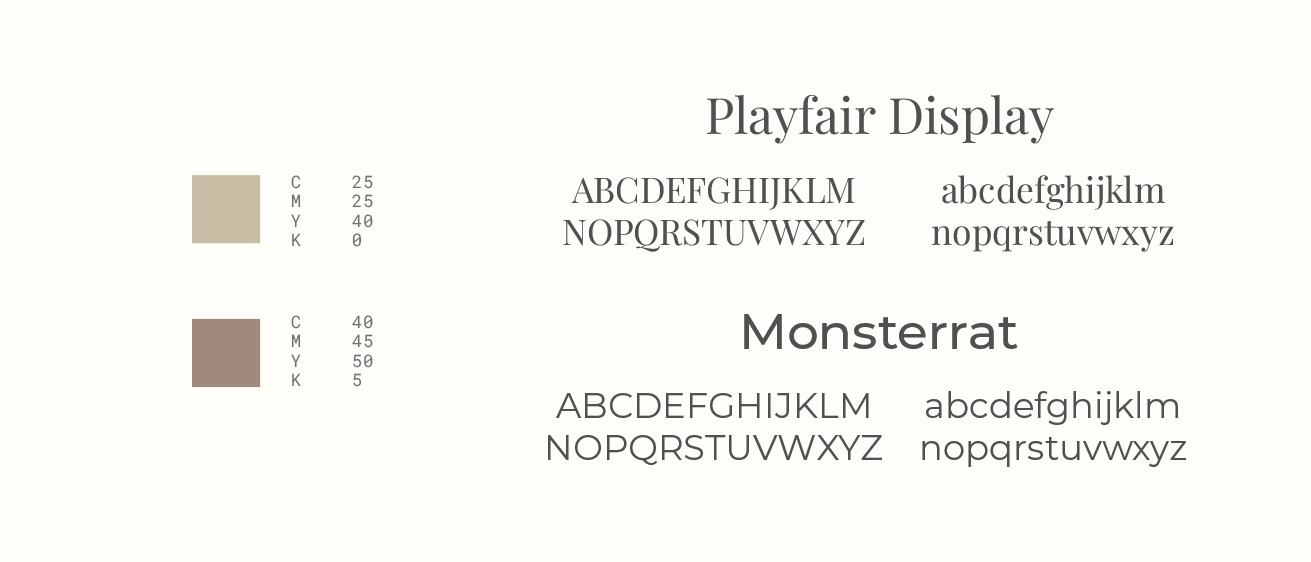
For the logotype, I chose the Playfair Display font, which was modified to give it a touch of exclusivity. The letters ‘A’ and ‘U’ were adapted to maintain consistency with the letter ‘V.’ This modification added elegance without compromising legibility. The spacing between the letters was increased for a sense of exclusivity and ease of reading.
At the bottom of the logo, I used the Montserrat font, a sans-serif typeface that creates an effective contrast with the serif font used for the name. This pairing emphasizes the two levels of the logo and contributes to visual harmony. The distances between the elements were carefully managed to ensure balance and readability.
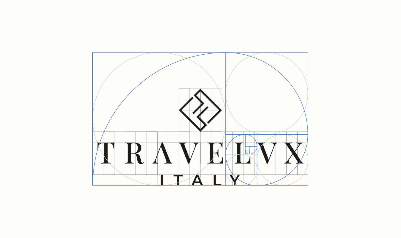
The design also adheres to the golden ratio rules, with the word ‘Lux’ placed on the right to visually divide ‘Travel’ and ‘Lux.’ These proportions create a sense of unity and harmony.
The color choice, in beige-sand tones, evokes the earth and natural elements, giving the brand an elegant and understated character. The darker color used for ‘TRAVELUX’ emphasizes the importance of the name.
In the end, the Travelux Italy brand reflects the company’s identity and character through a fusion of graphic and typographic elements. The attractive and well-balanced design represents the company’s mission to promote Italy and offer customized vacation solutions, with a touch of sophistication and modernity.
Date
August 16, 2023
